 Tweet
Tweet
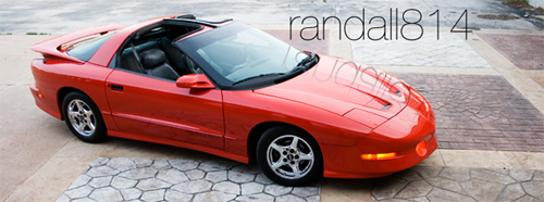
First of all, we need to update the image heading up top. It looks like either WordArt or one of those silly text generator websites made that banner. I whipped up something, obviously in the vein of my signature photo, that would update the look and feel. We could definitely change it like Brian does...I could make a new one highlighting the ride of the month by getting some images from the car owners. For now, since I have good pictures I took of my car, I used my own.
_________________________
Also, I think we should design some sort of normal splash page. When you go to mifbody.com, rather than building the homepage into the forum, you come to a normal page. In the navigation bar can be a selection for the forum.
Beneath the header would be the navigation bar. Self explanatory there.
The homepage could follow sort of the same formula going on at the current forum home. We could have a normal header image at the top with Michigan F-Body Association at the top (such as the one I designed). Then, the ride of the month would have their own section right in the middle area of the page, with a main photo and some minor details, with links to either a new page or a forum post with ALL the details you could want about why the care is ride of the month. We could keep the ride of the month navigation on the left with a thumbnail for each right of the month (not cut out, that makes the design look dated). Beneath the sidebar minifeature, we could list the sponsors with their logo thumbnails.
Beneath the ROTM section, we could have a small section devoted to current news. Fbody news, GM production news, all automotive industry news, marriages, babies, current events, points of interests, etc. in a digg.com fashion (without the voting system). This section could also be placed AFTER the photo/video section as described below.
Beneath the news section, we could have a photostream going from the photogallery, with random photos that cycle every time you visit. We could also have a section right below that with videos or a certain video (or maybe the highest rated video, if PEOPLE START USING IT MORE ).
).
On the right of the middle section, we could post a calendar in a more vertical, linear fashion. Here, users could post upcoming events like car shows, Fbody events, etc. Birthdays could also show up there.
The top 15 stat box could also go on the main page as it does the main forum page. Users would not even have to click to go to the forum to see the main 15 posts (which is what I look at most of the time.) This could be an alternative to clicking into the forum using the nav bar at the top.
As for the vbulletin forum we use, we really need to update the color scheme. Something more Fbody appropriate I guess. We kind of have a weird charcoal Mac OS theme going on here right now, and while I obviously love my Mac OS, I think we need some more muscle car flavoring for the forums.
Navigating the forums will now be easier with the top 15 on the homepage, you can see the forum categories much easier and faster. This will also help load times. Also, the sponsors and ROTM will be on the homepage. We could easily put a "Sponsors" and "Rides of the Month" link on the left nav bar once users are in the forum portion.
And the shoutbox, in my opinion, needs to be nixed. It is rarely used, and when it is, people are usually not in it at the same time. I have never seen more than 4 people in there at one time. If everyone wants it to stay, it definitely wont be in the way too much.
I will design a little mockup homepage when its not 1:40 am.
_________________________
Also, I think we should design some sort of normal splash page. When you go to mifbody.com, rather than building the homepage into the forum, you come to a normal page. In the navigation bar can be a selection for the forum.
Beneath the header would be the navigation bar. Self explanatory there.
The homepage could follow sort of the same formula going on at the current forum home. We could have a normal header image at the top with Michigan F-Body Association at the top (such as the one I designed). Then, the ride of the month would have their own section right in the middle area of the page, with a main photo and some minor details, with links to either a new page or a forum post with ALL the details you could want about why the care is ride of the month. We could keep the ride of the month navigation on the left with a thumbnail for each right of the month (not cut out, that makes the design look dated). Beneath the sidebar minifeature, we could list the sponsors with their logo thumbnails.
Beneath the ROTM section, we could have a small section devoted to current news. Fbody news, GM production news, all automotive industry news, marriages, babies, current events, points of interests, etc. in a digg.com fashion (without the voting system). This section could also be placed AFTER the photo/video section as described below.
Beneath the news section, we could have a photostream going from the photogallery, with random photos that cycle every time you visit. We could also have a section right below that with videos or a certain video (or maybe the highest rated video, if PEOPLE START USING IT MORE
On the right of the middle section, we could post a calendar in a more vertical, linear fashion. Here, users could post upcoming events like car shows, Fbody events, etc. Birthdays could also show up there.
The top 15 stat box could also go on the main page as it does the main forum page. Users would not even have to click to go to the forum to see the main 15 posts (which is what I look at most of the time.) This could be an alternative to clicking into the forum using the nav bar at the top.
As for the vbulletin forum we use, we really need to update the color scheme. Something more Fbody appropriate I guess. We kind of have a weird charcoal Mac OS theme going on here right now, and while I obviously love my Mac OS, I think we need some more muscle car flavoring for the forums.
Navigating the forums will now be easier with the top 15 on the homepage, you can see the forum categories much easier and faster. This will also help load times. Also, the sponsors and ROTM will be on the homepage. We could easily put a "Sponsors" and "Rides of the Month" link on the left nav bar once users are in the forum portion.
And the shoutbox, in my opinion, needs to be nixed. It is rarely used, and when it is, people are usually not in it at the same time. I have never seen more than 4 people in there at one time. If everyone wants it to stay, it definitely wont be in the way too much.
I will design a little mockup homepage when its not 1:40 am.


Comment